F1 Data and Telemetry for Betting: Turning Sensor Feeds into Sharper Odds
 Available in US

Every F1 car generates over 300 gigabytes of data per race weekend. Tyre pressures, brake temperatures, fuel loads, throttle traces, suspension travel, energy deployment curves – the volume is staggering. For years, that data lived exclusively behind team firewalls. Now, fragments of it reach the public through timing screens, onboard cameras, and F1’s official analytics feeds. The punters who learn to read these fragments before the market absorbs them hold an informational advantage that no amount of gut instinct can replicate.
What Telemetry Data Is Publicly Available
The gap between what teams see and what punters see remains enormous, but the publicly available slice has grown meaningfully in recent years. F1’s live timing application provides sector times, speed trap readings, tyre compound and lap count, pit-stop durations, and interval data. During practice sessions, this data includes mini-sector breakdowns that reveal which corners a driver is gaining or losing time relative to the field.
The onboard camera feeds – available through F1 TV Pro and select broadcast packages – provide visual telemetry that no timing screen captures. Steering wheel inputs, visible tyre degradation through blistering and graining, brake dust patterns, and floor damage from kerb strikes all carry information about car performance and reliability that feeds directly into betting decisions. I have spotted floor damage on a leading car during FP2 that the timing data did not reveal, adjusted my race winner assessment downward, and watched that car finish outside the top five after scrubbing the damaged floor through the entire race distance.
Todd Ballard, co-founder of ALT Sports Data, described F1’s data ecosystem as having an unmatched combination of speed, strategy, and innovation when announcing their role as F1’s official betting data supplier. That appointment in February 2025 marked a step change in how betting-grade telemetry reaches the market, with ALT developing real-time predictive models fed by official F1 sensor data – the kind of information that was previously accessible only to team strategists.
Speed Trap Data and What It Actually Tells You
Speed trap readings are the most widely cited telemetry metric and the most frequently misinterpreted. A driver topping the speed trap at 340 kilometres per hour does not necessarily have the fastest car – they might be running lower downforce, benefiting from a slipstream, or carrying DRS while the cars around them are not. The raw number means nothing without context.
The valuable signal in speed trap data emerges when you compare the same driver’s readings across different sessions. If a driver’s speed trap reading increases by 4 km/h between FP2 and FP3, the team has either reduced wing angle (sacrificing cornering speed for straight-line pace) or introduced an upgrade that improves aerodynamic efficiency. Both changes affect race competitiveness in specific ways: lower wing angle favours overtaking circuits with long straights, while improved efficiency benefits all circuit types.
Cross-referencing speed trap data with sector times isolates the source of the change. If straight-line speed increases but the final sector (typically the most aero-dependent) slows by a comparable margin, the team has traded downforce for drag reduction. If straight-line speed increases without sector time loss, they have found genuine efficiency – a rarer and more valuable development that warrants adjusting race expectations upward. The Sparkco.ai analysis showing 0.95 correlation between implied probabilities and bookmaker odds tells you the market is efficient on average, but these within-session telemetry shifts represent the moments when the market has not yet processed new information.
Tyre Data: The Single Richest Betting Signal
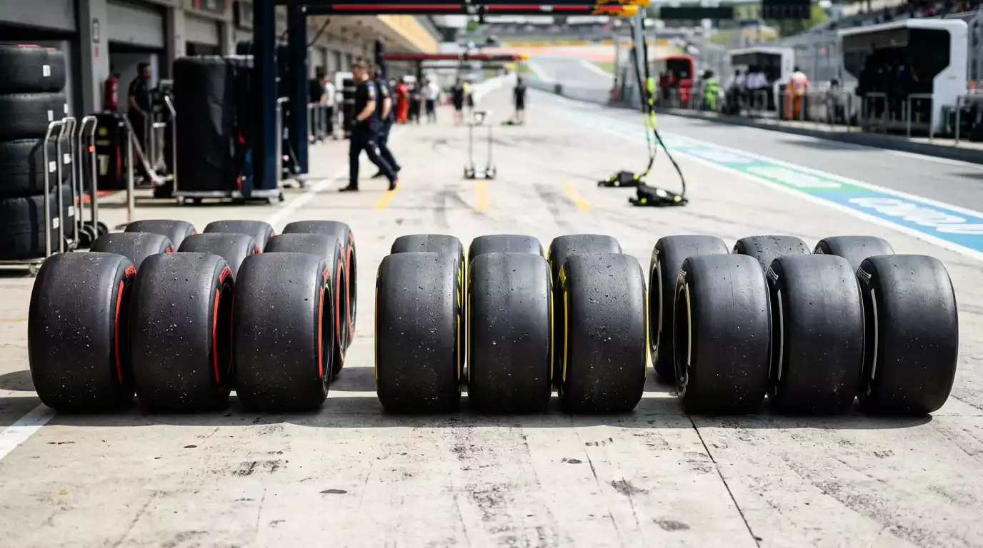
Tyre degradation data from practice long runs is the single most predictive input for race outcome modelling. Every team runs race simulations on Friday or Saturday morning, and the lap-by-lap degradation rates on each compound reveal which teams can sustain pace across a full stint and which will fade. A team losing 0.05 seconds per lap on the medium compound while their rival loses 0.12 seconds holds a massive strategic advantage – over a 20-lap stint, that difference accumulates to 1.4 seconds, roughly the gap between a podium and P5.
Reading degradation data from public timing requires patience. You cannot simply compare consecutive lap times because fuel burn-off improves lap times by roughly 0.07 seconds per lap as the car lightens. True degradation equals the observed lap time change minus the fuel correction. A driver whose lap times remain flat across a 10-lap stint is actually degrading their tyres at approximately the fuel correction rate – they are getting slower in real terms even though the stopwatch says otherwise.
I build fuel-corrected degradation charts for each team after every practice session and compare them to the circuit-specific historical averages. Teams degrading faster than their own historical baseline at a given circuit type are likely struggling with setup or carrying a development penalty from a recent upgrade. Teams degrading slower have either found a setup sweet spot or introduced a beneficial floor or suspension change. Both signals feed directly into tyre strategy and pit-stop timing predictions that shape my race-day positioning.
Energy Deployment and the Invisible Performance Variable
The hybrid power unit’s energy recovery and deployment systems – the MGU-K recovering kinetic energy under braking and the MGU-H recovering heat energy from exhaust gases – produce performance variations that are almost invisible to casual observers but show up clearly in sector time patterns. A team with superior energy deployment gains up to 0.3 seconds per lap through more aggressive battery use on certain track sections, and this advantage fluctuates between qualifying modes and race modes.
In qualifying, teams deploy maximum energy for a single lap. In the race, they must manage energy across an entire stint, and the trade-off between deployment aggression and battery longevity creates different sector time profiles. A driver who is consistently faster than their teammate in the final sector during qualifying but slower in the same sector during race stints is running out of deployable energy earlier in the lap – a sign that their deployment strategy is optimised for qualifying at the expense of race pace.
The 2026 regulations increased the electrical power contribution to 50% of total output, amplifying the importance of energy management. Teams that solved the new power unit architecture early gained a structural advantage in energy deployment that manifests as consistent sector time gains in power-application zones. Tracking which teams gain most in these zones across the opening races of the regulation era identifies the deployment leaders, and their race pace advantage will compound as the season progresses.
Pit-Stop Data and Operational Execution
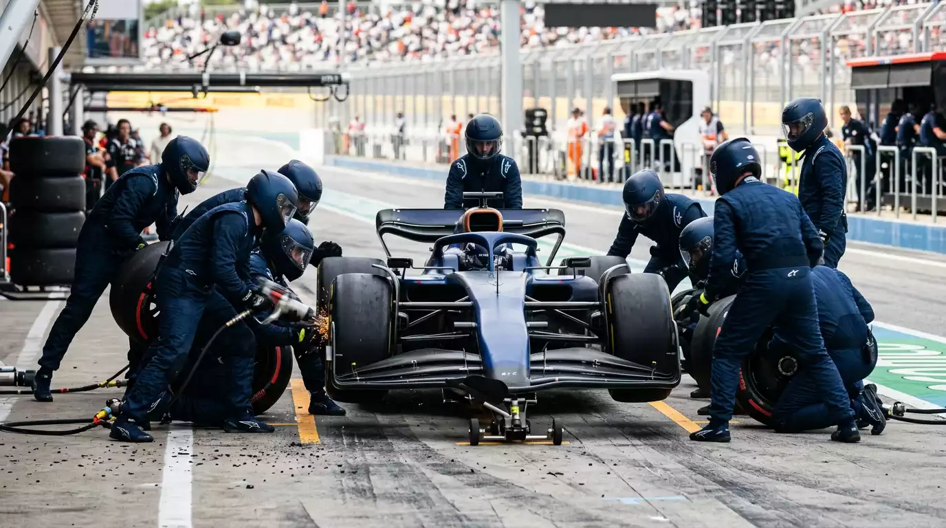
Pit-stop durations are published in real time and carry more information than the headline number suggests. The average F1 pit stop takes 2.2 to 2.8 seconds for the stationary period, but the total time loss includes entry speed, pit lane speed limit compliance, and exit timing. A team averaging 2.3-second stationary stops with clean entries and exits loses roughly 22 seconds per stop. A team averaging 2.7 seconds with occasional slow releases loses 24-25 seconds. That 2-3 second gap per stop, across a two-stop race, can determine whether a driver maintains position after a pit sequence or loses it.
Operational consistency matters more than single-stop speed. A team that averages 2.4 seconds with a standard deviation of 0.1 is operationally reliable. A team averaging 2.3 seconds with a standard deviation of 0.5 will occasionally produce a blazing stop but is equally likely to produce a 3.5-second disaster that costs three positions. For betting, the consistent team is the safer bet in markets where pit-stop execution determines the outcome – particularly undercut-dependent strategies at circuits where track position is difficult to recover.
Red flag periods reset pit-stop strategy entirely, allowing free tyre changes under stopped conditions. The probability of a red flag feeds into pit-stop-dependent market pricing, and the F1 2025 Season Review recorded 6.7 million cumulative race attendance, reflecting the kind of calendar density where street circuits and their associated red flag probabilities represent a meaningful share of the season. Factoring red flag probability into your pit-stop model for each race adjusts the expected value of strategy-dependent bets in ways that improve accuracy across the season.
Turning Data Into a Pre-Race Betting Workflow
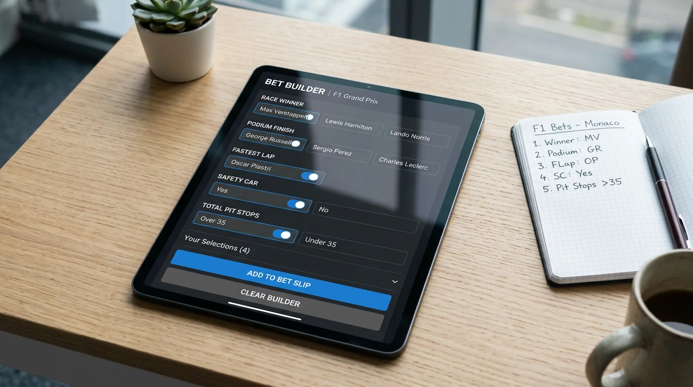
My data workflow on a race weekend follows a strict sequence. Thursday: review historical circuit data, set baseline performance expectations for each team. Friday: watch both practice sessions, record speed trap deltas, build fuel-corrected degradation charts, note any visible damage or upgrade introductions from onboard feeds. Saturday morning: finalise my race pace model using FP3 data and pre-qualifying long runs. Saturday afternoon: watch qualifying, record actual versus expected qualifying positions, and identify mispricing in the post-qualifying race winner and podium markets.
Sunday morning: check weather updates, review any overnight car changes declared in the parc ferme documentation, and place my race bets based on the composite picture from Thursday through Saturday. The entire process takes roughly four hours of active analysis across the weekend, concentrated into the practice and qualifying sessions. The race itself is for watching, managing any in-play positions, and recording the outcome data that feeds next week’s analysis.
This workflow is not complicated, but it is consistent. The edge does not come from a single brilliant data read – it comes from applying the same rigorous process to every race weekend across a 24-race season, building a dataset that grows more predictive with every data point added. Jonny Haworth, F1’s Director of Commercial Partnerships, noted the sport’s ambition to model predictions around race events rather than just outcomes, and that vision aligns exactly with the kind of in-race data analysis that separates informed F1 bettors from everyone else.
Can regular punters access F1 telemetry data for betting?
Yes, though with limitations. F1’s live timing app provides sector times, speed trap readings, tyre data, and pit-stop durations. Onboard camera feeds show visual telemetry like tyre wear and floor damage. ALT Sports Data’s role as official betting data supplier is expanding public access to predictive analytics built from official sensor data.
What is the most useful F1 data point for betting decisions?
Fuel-corrected tyre degradation from practice long runs is the single most predictive data point. It reveals which teams can sustain race pace across full stints, directly informing pit strategy predictions and race outcome probabilities. Raw lap times without fuel correction are misleading.
How much time does data-driven F1 betting analysis take per race weekend?
A thorough data workflow takes approximately four hours of active analysis across a race weekend, concentrated during practice and qualifying sessions. This covers reviewing historical data, building degradation charts, recording speed trap deltas, and comparing actual qualifying results to model expectations.
Prepared by the f1 Betting Guide editorial staff.